Flexbox
The 2 main components of a flexbox system are the flex container and the flex items
- therefore, some of the CSS properties are to be set on the container, while others are to be set on the items
When aligning things with flexbox, we must consider the main axis and the cross axis.
- when using
flex-direction: row, the main axis is horizontal, while the cross axis is vertical. This is swapped when we haveflex-direction: column.
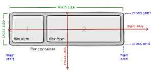
- main axis – The main axis of a flex container is the primary axis along which flex items are laid out.
- main-start | main-end – The flex items are placed within the container starting from main-start and going to main-end.
- main size – A flex item's width or height, whichever is in the main dimension, is the item’s main size. The flex item’s main size property is either
width(forfd: row) orheight(forfd: column). - cross axis – The axis perpendicular to the main axis is called the cross axis.
- cross-start | cross-end – Flex lines are filled with items and placed into the container starting on the cross-start side of the flex container and going toward the cross-end side.
- cross size – The width or height of a flex item, whichever is in the cross dimension is the item's cross size. The cross size property is either
height(forfd: row) orwidth(forfd: column).
When you set a container to display:flex, it defaults to flex-direction:row, and its flex items will have widths based on their content.
- Applying flex-grow to a flex item instructs the item to expand when there's available space within the container.
- If we set all items to flex-grow:1, like in your example, they will proportionally share the remaining space equally. However, it's essential to note that initially, they are not of equal width. The additional space is added to the initial width of each item (the content width).
note: all examples below assume flex-direction: row. If column, then substitute width for height.
Flex Container Properties
Using explicit margins breaks flexbox's ability to position things nicely, since it doesn't play nicely with the math that it's relying on
When doing flexbox row, don't use margin left/right, and when doing column, don't use margin top bottom, because it interferes with the math that flex is doing
- try and use justify-content: space-between instead, and set flex: 0 49% for example, which will almost serve as our margin
gap
gap should be used when determining spacing between flex items, since it only affects spacing between the items themselves. Therefore, gap will not add spacing to the side of a flex item that has no other item on that side.
- could be thought of as a minimum gutter, as if the gutter is bigger somehow (because of something like justify-content: space-between;) then the gap will only take effect if that space would end up smaller.
Flex Item Properties
flex-grow
- when there is available space after all boxes have taken up their room,
flex-growwill allow the item to grow proportionally to the other item'sflex-growproperty.- therefore, all items having
flex-grow: 1is the same as all items havingflex-grow: 100. Think of it as a proportional growth rate.- ex.an item with
flex-grow: 3will grow 3 times faster than an item withflex-grow: 1
- ex.an item with
- therefore, all items having
- a value of
0means the item won't be resized during the size calculation to accommodate the flex container's full main axis size - Imagine we use different flex-basis for each flex item. Even if we have
flex-grow: 1on each item, they will still grow at a different rate, because of the basis at which they started.
UE Resources
flex-shrink
- The rate at which a flex item will shrink when the page is resized to a size smaller than the flex-containers most "comfortable" size.
flex-basis
flex-basis defines the default size of a flex item before any available space is distributed among the flex items (which is determined according to flex-shrink and flex-grow).
- the value can either be a length (e.g.
20%,10px) or a keyword (autoorcontent) flex-basiswill override anywidthproperty, unless left asautoflex-basisstill obeysmin/max-widthsettings- In a sense, it is similar to
min-width(althoughflex-shrinkdetermines how the flex item will behave when the size of the whole flexbox shrinks below initial size)- If we were to use
min-widthand shrink the browser size, the browser would make us scroll horizontally to see all of the content.
- If we were to use
Keywords
auto(default): "look at mywidthorheightproperty. If I have none, use the content of the item to determine size"content: "size it based on the item's content"- may have some browser support issues
Flex Shorthand
- by default, it is
flex: 0 1 auto flex: 1 1 0- ==flex-grow== ==flex-shrink== ==flex-basis==