CSS Best Practices
General Readability Principles
Line-height
pick a minimum line-height: 1.4 for body copy. Headings should be tighter.
Line-width
Keep it to 60-80 characters wide
Size
- use
remforfont-size - use
pxforborder-width - use
emfor everything else
Different font sizes on a webpage should be related by a common ratio (source)
- ex. if we choose that ratio to be 1.25, then our ems will be: 0.64, 0.8, 1, 1.25, 1.563, etc.
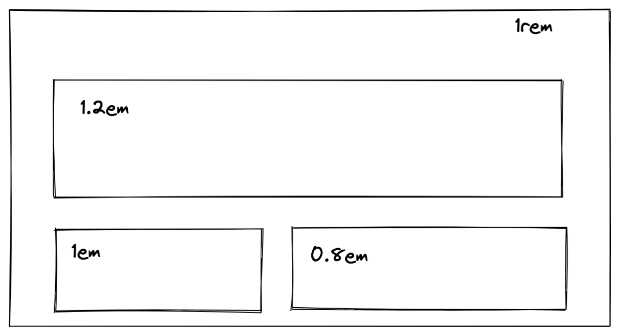
We can set the base-size font on a container using rem, and then we set size of the children content using em. This allows the children using em to leverage the font-size set on the parent (the rem value). Now, when we adjust the rem value, all the em values depending on it will adjust as well, while keeping their proportions.
- This method works well for images as well
This method can be synergized with:
@mediaqueriesvwunit withfont-size. This will cause the font-size to grow/shrink smoothly with no abrupt breakpoints. We need to do some math to define min size (0.5em):font-size: calc(0.5em + 1vw)
Magic numbers
When using magic numbers, add a comment to explain how it was derived:
.gallery__item {
    @media (min-width: 800px) and (max-width: 1200px) {
        width: 21.25%; /* (100% - 15%) / 4 */
        &:nth-child (4n) {
            margin-right: 0;
        }
    }
}